This post is about one of my 45-second pitches at my BNI Chapter, BNI City Business. You can read the introduction to this collection here.
15 September 2023. Back to What Were They Thinking? brand logos in my bad logo series. This one is potentially an example of cultural context. Maybe it is just failure to step back and see what everyone else sees. This is also another example of a logo that looks different when rotated by 180°. Well, clearer at least.
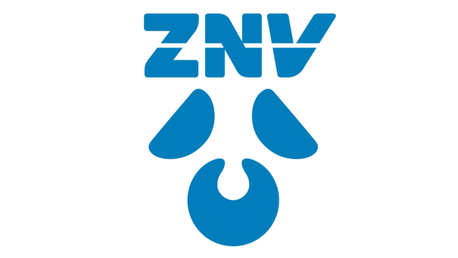
The logo is, of course, a drinking straw poked into the lid of a milktea container. And a chef’s hat that looks more like a cloud. I am sure this could have been made a lot clearer.
Rotated logos are a great source of amusement. When I lived in Singapore, I met with someone from the ANZ Bank, sponsors of the New Zealand Chamber of Commerce in Singapore’s annual ball. They were going through a rebrand globally. You may remember their logo:

The ANZ rep handed me his new card (in a very un-Asian fashion). The new logo very prominent:

Unfortunately, the card was facing him, not me. The logo I saw was more porcine in appearance:

I didn’t say anything at the time, but every subsequent meeting with ANZ employees seemed to involve some discussion of their pig-logo. I can’t now not see this whenever I see their logo. The Piggy Bank.
Brands and logos are tied to the value for your firm. Done right, they are value enhancing. But you can’t control how they are seen and used once they are out there.
Something rare happened this week: I made a last-minute change to the text. Below is the original.

The text almost said Just Put It in Your Mouth and Suck but I decided that was unnecessarily direct. Most people in the room seemed to get it anyway, no need to labour these things.
